


Want to make your room feel bigger without knocking down walls? Colour capping is your answer. This clever paint technique is taking the design world by storm.
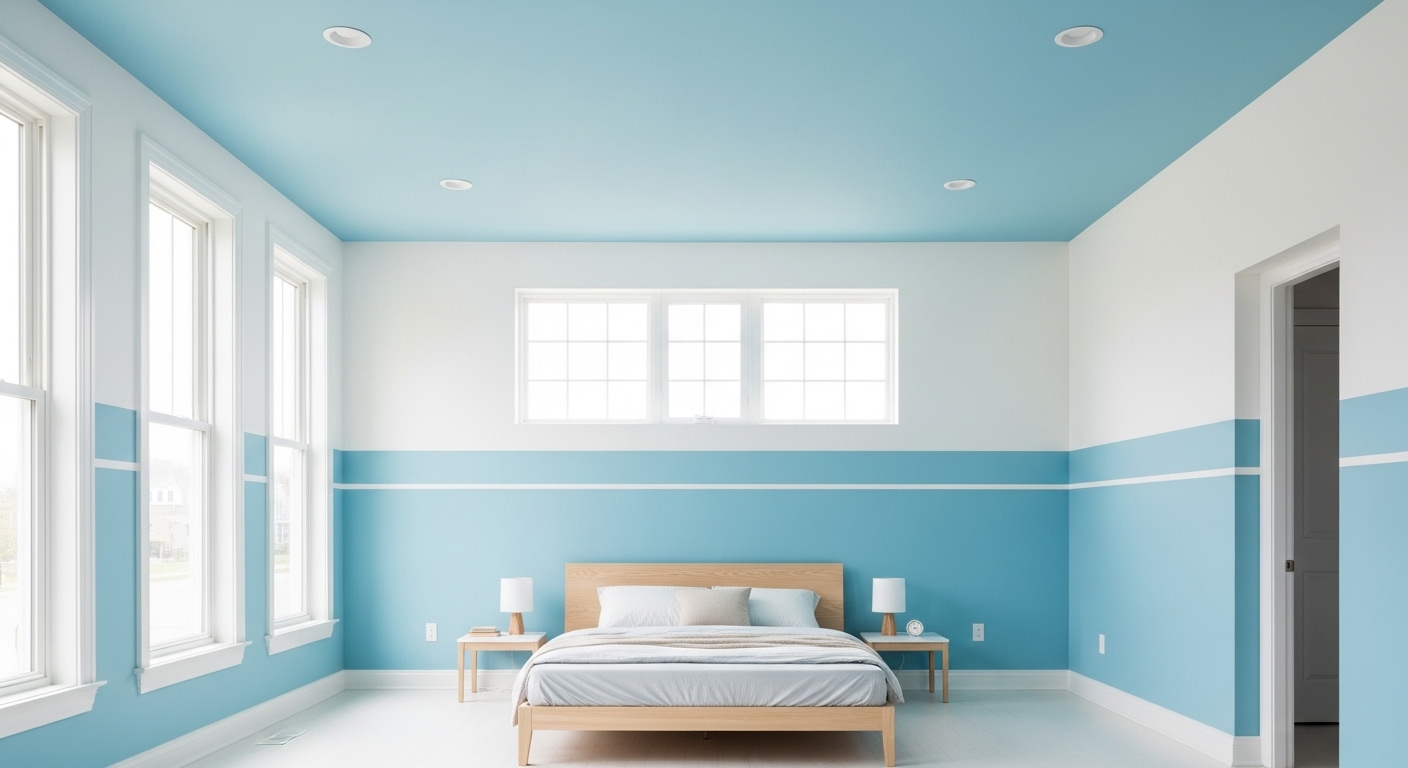
Here’s what makes colour capping special: instead of painting everything one shade, you create a gradient flowing from walls to ceiling. Your ceiling becomes the star with the deepest colour, whilst your cornicing gets a mid-tone, and walls stay light. These three shades work together to create the illusion of a more spacious room.
By using the deepest shade on your ceiling, a mid-tone on the cornicing, and keeping walls lighter within the same colour family, you’ll create a stunning sense of flow that enhances your space.
Move beyond stark white ceilings. Colour capping offers a designer look with just a few tins of paint. Unlike colour drenching, this technique layers tones for a calm, curated feel.
Whether refreshing your living room or bedroom, colour capping creates seamless effects that eliminate harsh ceiling lines. This guide will show you how to master this technique.
What is colour capping and why it’s trending
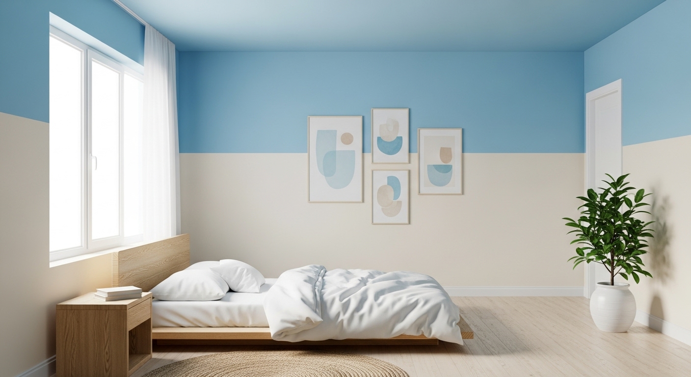
Pictured: Colour capping bedroom interior design, wooden bed.
Colour capping has become a beloved decorating technique. This method creates a gradient using three shades from the same colour family – the deepest for ceilings, mid-tone for cornicing, and light for walls.
How it differs from colour drenching
Think of colour capping as colour drenching’s sophisticated cousin. While drenching uses one colour throughout, capping creates visual interest through subtle gradients.
The role of the ceiling as the fifth wall
We’ve long painted ceilings white without thought. Colour capping changes this by treating your ceiling as the fifth wall.
When you paint your ceiling in the deepest shade, it becomes a striking focal point that adds character to any room. Your ceiling transforms from an afterthought into a feature worth noticing. The gradient effect softens harsh lines between ceiling and walls, creating a flowing space.
Why designers are embracing this trend
Designers favour colour capping for its sophisticated results achieved through simple execution – requiring just three paint shades and basic skills. The technique creates harmony while maintaining interest through tonal variations.
The gradient softens lines between architectural elements, creating a cohesive design. The technique suits both traditional and contemporary homes – a versatility many trends lack.
Best of all, colour capping allows controlled use of darker colours without overwhelming your space – ideal if colour drenching feels too bold but you’re ready to move beyond neutral walls.
How to apply colour capping in your home
With proper planning, you can achieve stunning professional results.
Which rooms work best for colour capping?
Living rooms and bedrooms are ideal candidates, benefiting from the cosy atmosphere colour capping creates. Kitchens also work well, especially with green or blue tones that add freshness.
Avoid utility rooms or dark spaces, as deeper colours can make dim rooms appear lifeless. Rooms with complex architectural details might feel overwhelming with multiple tones.
How to use your home’s architecture to your advantage
Period features like cornicing and picture rails provide natural boundaries for colour transitions. High ceilings benefit from deeper shades above picture rails, highlighting their height.
Modern homes without period features can use colour variations to define zones and add architectural interest. Let your room’s geometry guide colour placement.
Keep things on track:
- Begin with your ceiling and work down, applying your darkest shade first to easily correct any mistakes.
- Use an angled cutting-in brush for precise lines at ceiling-wall junctions.
- Apply decorators’ tape at transitions and seal with background colour before adding new shades.
- Remove tape while paint remains slightly wet, pulling at 90 degrees for clean lines.
Takeaway Tip: for gentler transitions, feather edges with a dry brush whilst the top colour remains wet.
Which colours suit your project?
Your colour selection determines the success of your colour capping project. Choose wisely for professional results.
Creating your tonal palette
Select one favourite colour, then build your gradient using lighter and darker versions. Consider forest green walls rising to sage cornicing and emerald ceiling, or clay walls with terracotta accents.
Ensure all shades share undertones for cohesion.
Selecting your mood
Cool tones like charcoal and midnight blue add sophistication, ideal for living spaces. Warm shades like terracotta and olive create cosiness, perfect for bedrooms.
Takeaway Tip: blues and greens make rooms appear larger.
Choosing paint finishes
Use matte finishes for ceilings and upper walls to hide imperfections. Choose eggshell for practicality, and reserve gloss for highlighting architectural details.
Avoid these mistakes
- Consider natural light – north-facing rooms need warm tones, south-facing suit cool shades
- Don’t mix warm and cool undertones
- Test colours throughout the day before committing
Remember to ensure your chosen shades work harmoniously whilst creating visual interest. Always test small patches first if uncertain.
Bringing your colour capping scheme together
Once you’ve mastered the technique, focus on creating a cohesive room. Your colour capping forms the foundation for your overall design scheme.
Choosing furniture that works with your palette
Echo your wall and ceiling tones in your furnishings. Consider a velvet sofa in your ceiling’s deeper shade, balanced with lighter rugs and curtains matching your walls. This coordination creates a layered atmosphere where everything feels connected.
Add the finishing touches with accessories
Reinforce your colour capping with carefully chosen accessories:
- Cushions and throws matching your cornicing shade
- Ceramics and decorative pieces in complementary tones
- Artwork featuring colours from your palette
Mix in metallic fixtures and wooden furniture for texture.
Getting your lighting just right
Choose statement light fixtures that emphasise your ceiling and enhance your gradient effect. Aim for a gentle flow throughout your space.
Create a colour capping scheme worth shouting about
This sophisticated technique works in any home, from period properties to modern spaces. With three coordinating shades and basic painting tools, you can achieve professional results in a weekend.
When you align your furniture, soft furnishings and lighting with your chosen tones, you’ll create an intentional, curated space. Your ceiling becomes a striking feature, drawing the eye upward and enhancing your room’s elegance.
Consider trying colour capping for a perfect blend of elegance and ease. Your spaces will feel larger and more cohesive. Ready to transform your rooms? Grab those paintbrushes!