This spring will see the 20th Comptoir Libanais open its doors in the UK at London’s Southbank Centre. Known for bringing caringly prepared Lebanese food to diners, Comptoir Group challenged Harrison, the full service 360 brand and design agency, to evolve the brand whilst retaining the distinctive, colourful, fun nature Comptoir Libanais has become known and loved for.
Presenting Comptoir Libanais with the opportunity to introduce itself to a new customer base, owing to the new location’s popularity with tourists, the team wanted the design to incorporate layers of authenticity and elegance. At the same time, the Harrison team faced the challenge of a multi-level space which offered incredible natural light and visibility on the upper floor, but a dark and gloomy lower level which was at risk of being underutilised and not inviting for customers.
Emily Betty, Design Manager and Senior Interior Designer at Harrison, comments: “Comptoir Libanais is a truly immersive experience, with a strong base of existing customers who love their restaurants not only for their food, but for making people feel like they’ve stepped into a whole different part of the world. It has a colourful décor which stands out on the high street, coupled with bright flora and displays of adornments inspired by travels to the Middle East and North Africa. We wanted to stay true to the brand while helping it take the natural next step in their evolution. If you look across the high streets, it’s the restaurants which have learnt to evolve in a considered way which have stood the test of time, and this is what we hope to do with the team at Comptoir.”
When it came to the design, Harrison wanted to ensure authenticity shone through. Bold but muted walls are the perfect background for carefully sourced artwork. Many of the lighting fixtures have also been sourced from Comptoir’s extensive store of curated pieces. A decorative tiled floor finish runs from the ground floor all the way to the back of the lower ground space, connecting the two spaces together.
With a focus on sustainability, the Harrison team looked to repurpose and up-cycle items wherever possible. This included using existing tables left by the space’s previous tenant, and restoring them by cleaning, painting and applying digital art to the tops. This is coupled with reusing furniture from previous Comptoir Libanais sites and stores to ensure nothing is wasted and minimise the level of new items needed.
“The new Comptoir Libanais is occupying a large space – with a unit size of 315 sqm. We needed to develop a design which not only flows and feels like one unified space but could take diners from breakfast through to cocktail hour”: adds Emily.
“At the same time, functionality in a busy location had to be a priority for the team. We’ve tried to incorporate maximum flexibility with lots of two-seater tables which can be pushed together as needed for larger parties, as well as a large table on the ground floor which can be used for big bookings or as a sharing table. Features such as creating an attractive bar at the back of the lower ground not only allows easy access for their team, but for guests it’s a space which creates a theatre downstairs as bartenders and cocktail masters create delectable drinks while signalling that Comptoir is a day-to-night offer, with bottles in pride of place. Even the simplest of features will have a purpose and likely more than one job to do in this hard-working but beautiful restaurant.”
Tony Kitous, Founder of Comptoir Libanais, adds: “When we appointed Harrison we wanted to embark on a journey of evolution – taking our brand, which has worked hard to serve customers and introduce them to Levan cooking since 2008, and look forward to where we want it to be in the future. It’s about growth and ensuring we stay at the forefront of the restaurant and dining scene. Translated, Comptoir Libanais means ‘Lebanese Counter’ – and we feel Harrison has encapsulated this perfectly in the evolved design. The new Southbank restaurant is a friendly, generous and relaxed space which we feel will truly take people on that journey of our heartland through the décor and our food.”
Key Design Features:
Intertwining a considered layout with clever design at the new Comptoir Libanais was a priority for the Harrison team when approaching the brief, to ensure a cohesive flow throughout all of the spaces which would attract customers to both levels across all points of the day. Key features include:
- Maintaining an open kitchen on the ground floor allows for the theatre of the cooking to be at the heart of the restaurant – a key building block in the Comptoir brand. An open decorative gantry detail wraps around the servery and ties into the wall decoration to allow for Comptoir’s distinctive loaded bric-a-brac to be on full display.
- The main entrance of the restaurant has been moved from a central door set to a double door on the left-side to allow for a dedicated ‘welcome’ space with a meet-and-greet to ensure the customer experience starts from the second a diner walks through the door. This means people will get immediate views of the open kitchen and arched lower ground, immediately drawing them into the space.
- To make the lower ground floor a more attractive and appealing space, Harrison wanted to add a standout feature. A large, centralised tree-like structure with vines, greenery and lighting is a show-stopping centrepiece. The structure is held within a rendered spine wall which provides the ideal space for lush greenery, while at the same time allowing for central fixed seating to ground the arrangement.
- Around the perimeter of the downstairs, the Harrison team have incorporated four-seater booth tables, allowing people intimate spaces to dine while bringing them closer to the details in the curated 2D art and photos.
- With the challenge of water ingress in the railway arch, the Harrison team had to clad the brick to create a drainage solution for any potential leaks. Wanting to keep the character and view of the brick, they were able to leave around a third of the central brick exposed, with the colourful cladding adorned with climbing ivy to give a wild aesthetic.
- Seating at different heights breaks up the spaces and creates different zones for different occasions, from mid-height booths around the servery for those who want a dining experience to views looking out and across to the open-plan kitchen, coupled with high tables towards the back of the space near the bar for those who want a light-bite and drink pre- or post-theatre.
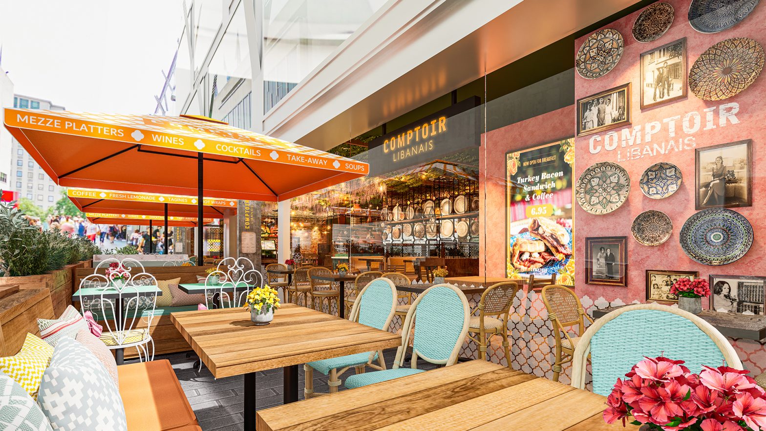
- Outside, the seating area is framed with plants to add an injection of nature on a busy London walkway. More natural rattan furniture and colourful chairs all tied in with bright fabric seat pads will bring the colour of Comptoir outside, while four heated umbrellas cover the space making it an attractive offer in all seasons.

